February 17, 2023
Introducing kyber: minimalistic quality assessment plot for long reads
I am releasing kyber today, and you can find all about it on GitHub.
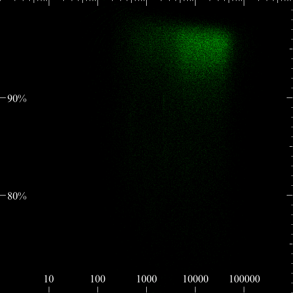
In short, kyber produces a heatmap showing where the majority of your reads are. On the x-axis is the log transformed read length, on the y-axis the accuracy (optionally Phred-scaled). The axis ranges are fixed and therefore easier to compare various datasets. The intention is to have a minimalistic and fast impression of your dataset.
Example below: