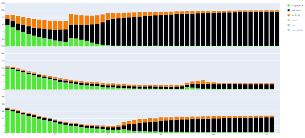
Comparing the pore status of flow cells
A (for us) very useful diagnostic of a nanopore run is the status of the pores: if they’re sequencing (‘single_pore’), saturated, unavailable or multiple. It is also interesting to see how fast you are losing pores or killing your flow cell with e.g. a particularly blocky library.
Fortunately these metrics are since not-too-long ago saved in the mux_scan_data files created by MinkNOW, so I wrote a script to visualize and compare the pore status. One caveat: these files don’t record the time of the mux_scan, just the order. By default the time between muxes is 1.5h. But since you can manually retrigger a mux scan you’ll get a new data point - and it is not recorded that you did that yourself. So the plots are not necessarily synced on the x-axis in sequencing-time, but in number-of-muxes.
Below are two examples, in which you can already clearly see some differences between the runs with respectively 3 and 4 flow cells per image. Every ’lane’ is a PromethION run (with 12k pores).
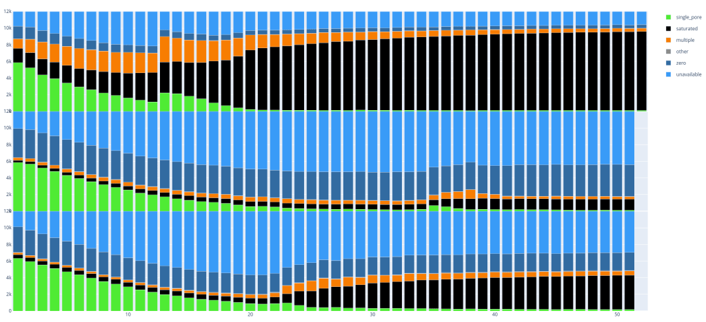
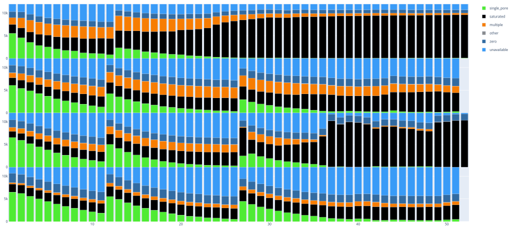
Since these plots are in dynamic HTML format you can also easily select parts you want to see, if you are for example only interested in single_pore, saturated and multiple: