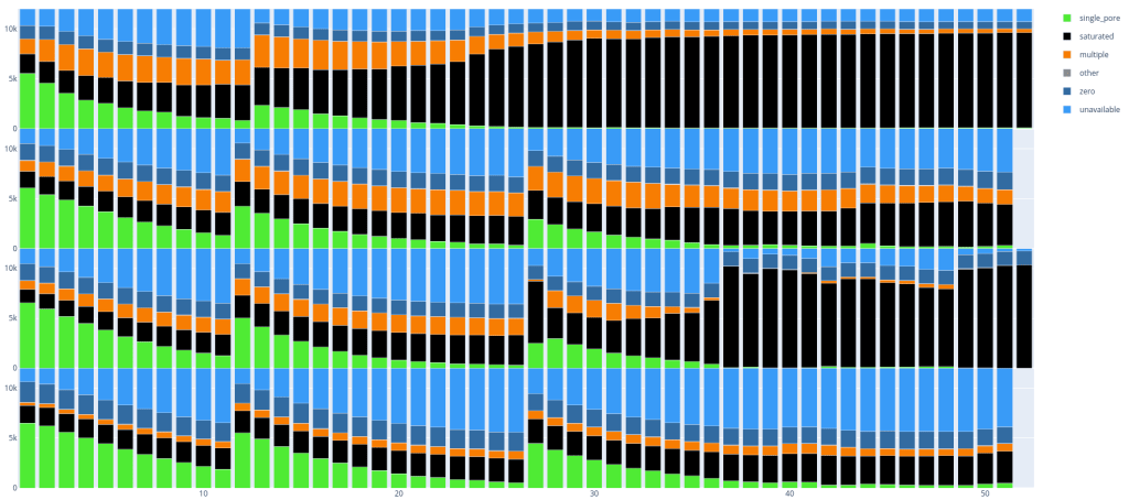
Stacked bar chart of FILTER information from a multi-sample VCF
I wanted to make a stacked bar chart to show the number of variants with a certain FILTER status per sample from a multi-sample VCF. Nowadays I make all plots with plotly, because it’s fast, convenient to write and dynamic HTML makes it easier afterwards to select the bits I’m interested in to show. In the example below I have to hide the sample labels, as these are confidential. The example is of course a static screenshot, and the HTML output is lots more fun to play with. In this case the VCF is from Mutect2 somatic variant calling and the number of PASS variants is rather low!
Here is the code I ended up using, with the excellent cyvcf2 to parse the VCF file and pandas to gather and process all data. I don’t really like that cyvcf2 puts ‘None’ as FILTER status when the FILTER is PASS, so I explicitly have to fix that in the is_variant function.
https://gist.github.com/wdecoster/6c6cfe30a1af4d67b5ac64dee9294fba varplot.py