Example gallery of NanoPlot
I am developing NanoPlot, a python package for plotting various aspects of Nanopore sequencing data (fastq) and alignments (bam). It’s a python script, heavily using the seaborn package for creating plots. The package is available on GitHub and I welcome all feedback and suggestions!
In this post, I will show some examples of plots. The data is from the Cliveome flowcell FAB48453, after repeating the basecalling with albacore v1.1.0 followed by filtering and trimming using the NanoPlot companion script NanoFilt.
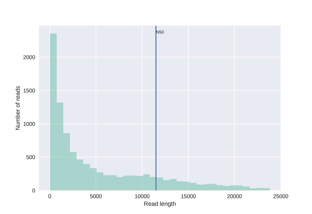 This plot shows a simple histogram with read N50 metric.
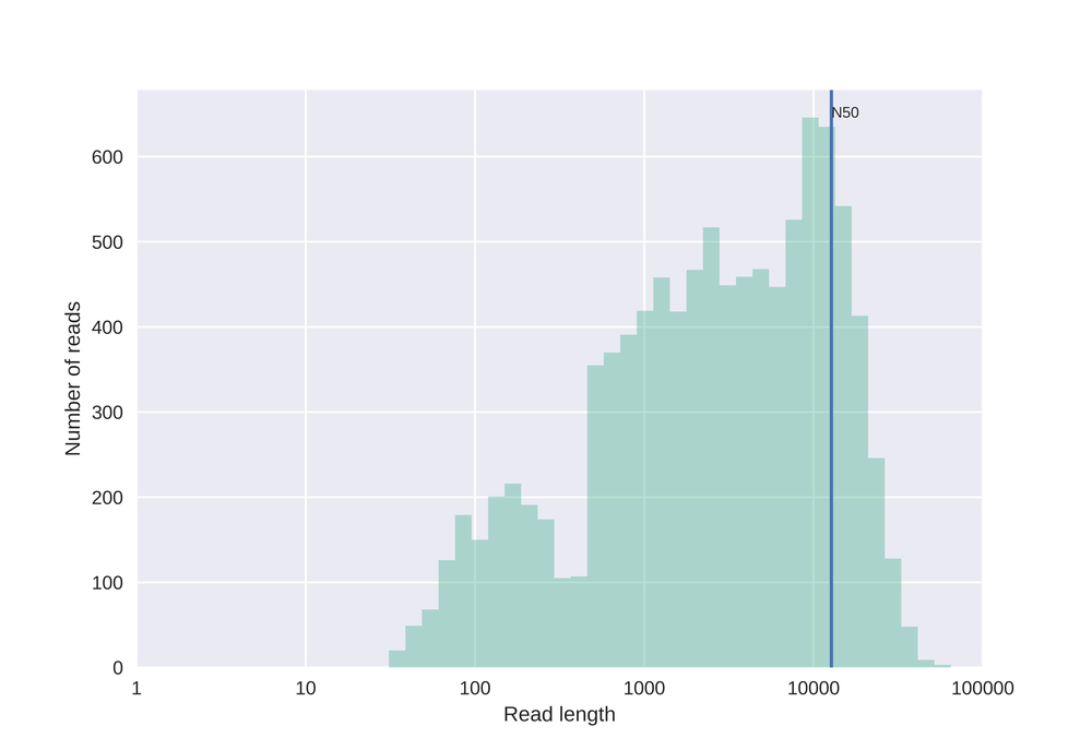 Similar to the plot above, but here with log10 transformed read lengths.
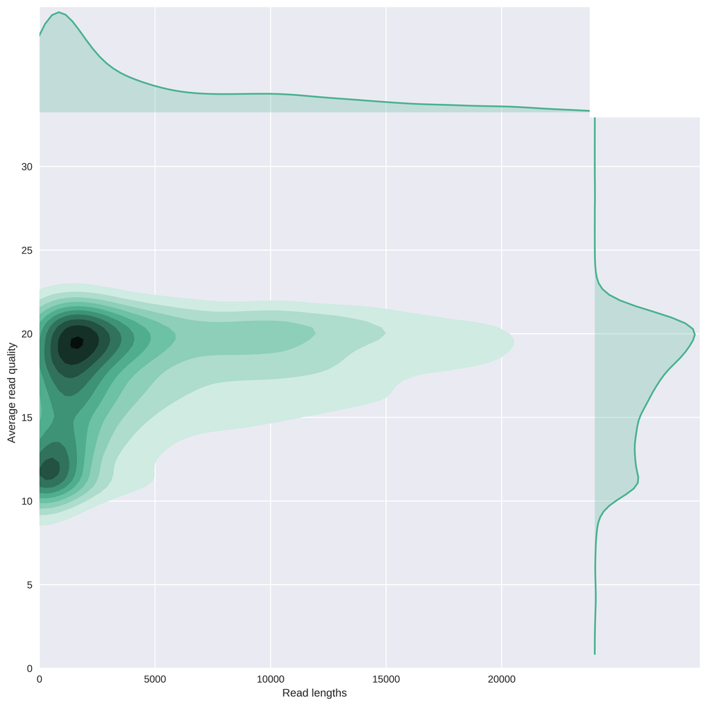 This bivariate plot shows with a kernel density estimate the read length compared to the average read basecall Phred quality.
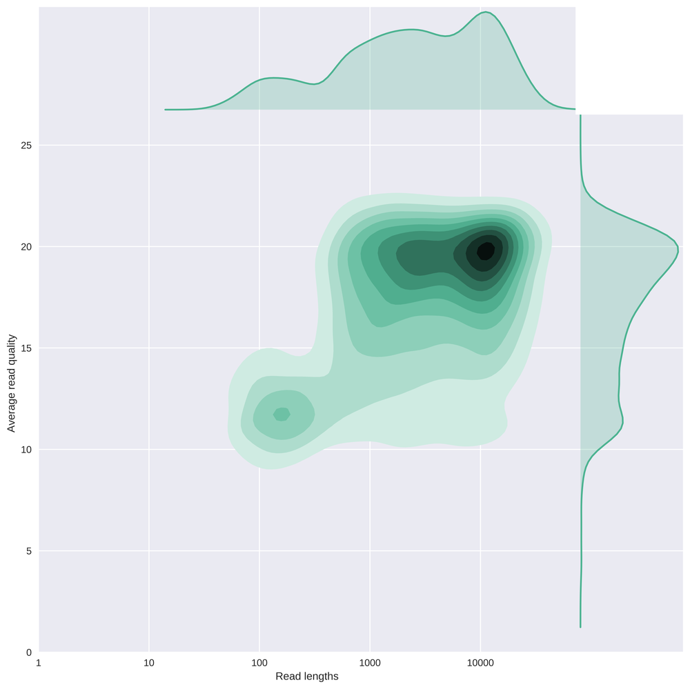 This plot contains the same as above, but again with a log10 transformation on the read lengths.
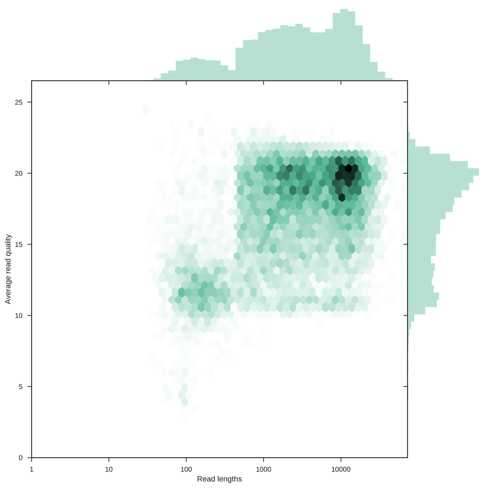 This plot is the same as the previous, but instead of a kernel density estimate here hexagonal bins are used to show the distribution of the data.
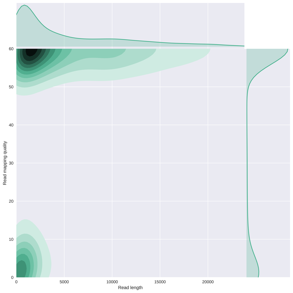 Here is a comparison of the read length with the mapping quality of those reads after alignment using bwa mem -x ont2d. Clearly there is a subgroup of small reads showing very low mapping quality.
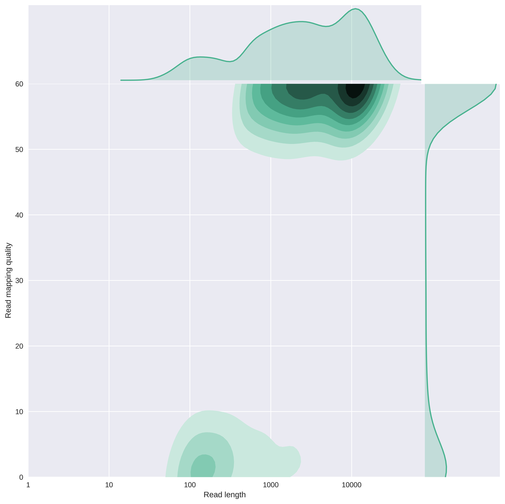 This is the same plot as above but with a log scale on the read length.
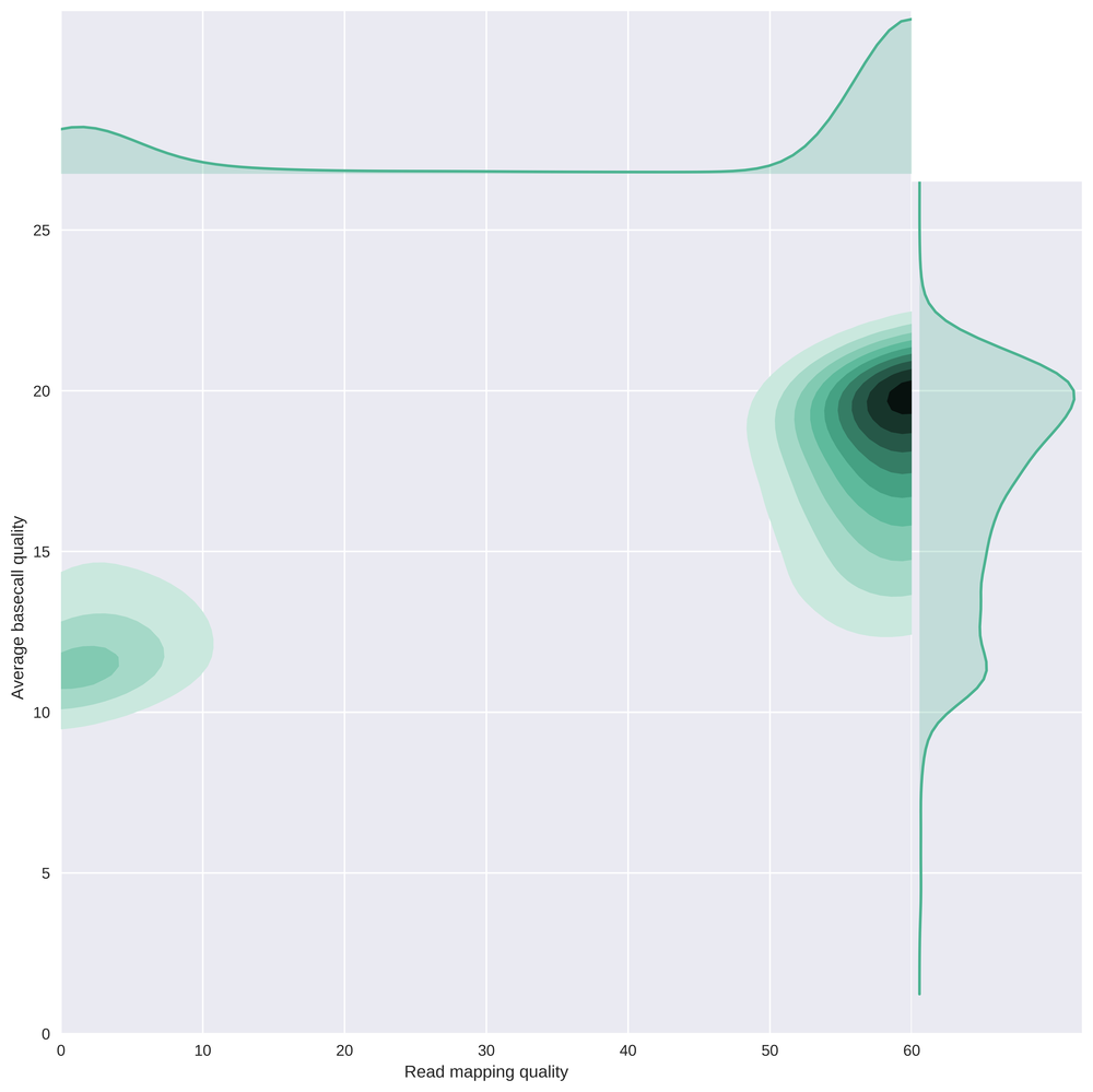 This plot compares the average basecall quality of reads with their mapping quality, clearly showing that there is a subgroup of low quality reads which are essentially useless. Keep in mind that the worst quality reads were removed from this dataset prior to alignment.
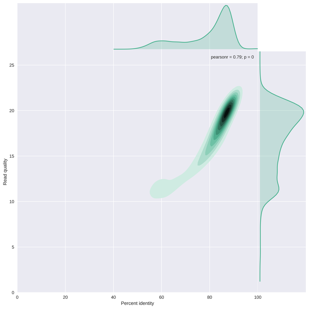 This plot compares the percent identity (the edit distance to the reference genome scaled by the read length) with the read quality. The majority of the reads have a percent identity of about 85-90%, but with a long tail to identities of ~60%.
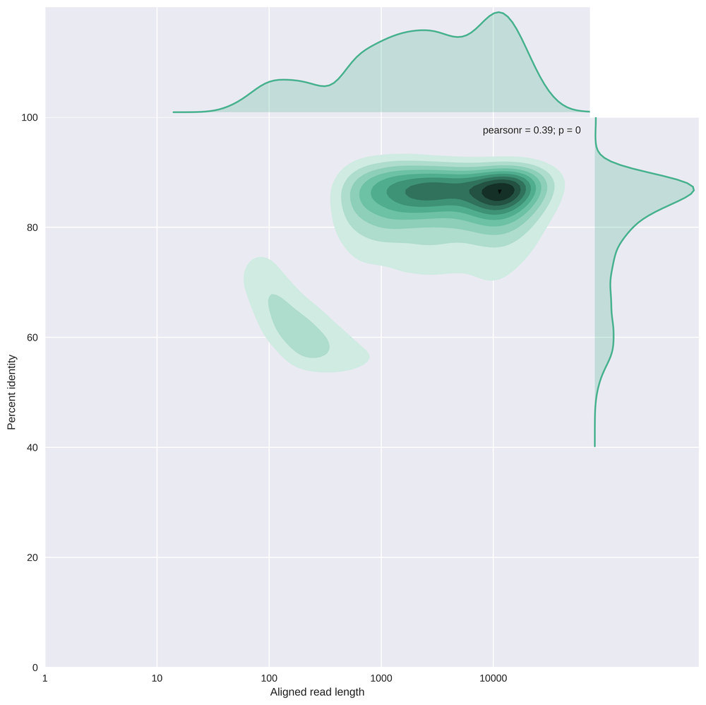 This plot compares the read length (log10 transformed) with the percent identity.
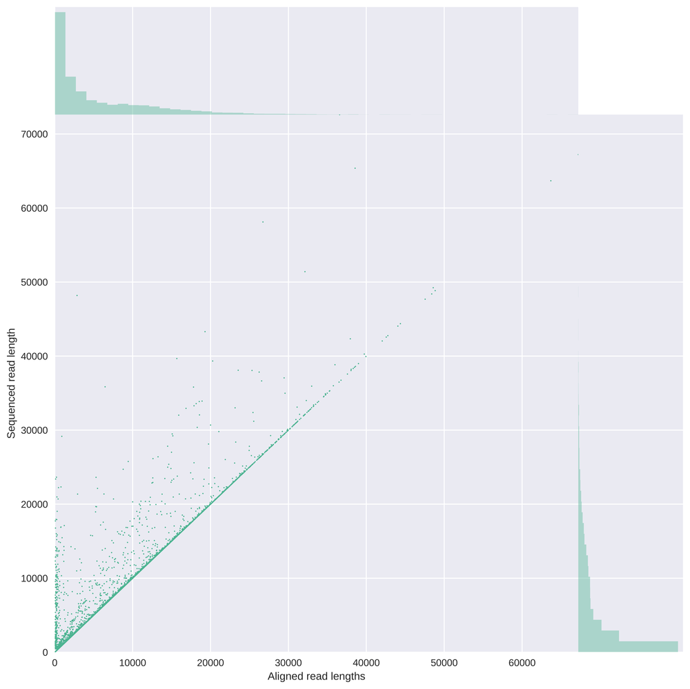 In this graph the read length is compared with the aligned read length, showing an expected line on the bisection but also showing reads which are not fully aligned due to softclipping.